NCVRD: How Jesse Jay created the visual world around Kirani Ayat’s ‘Aisha’s Sun’
“Everything done on this cover was deliberate”
“Everything done on this cover was deliberate”
In mid-September, Ghanaian rap artist Kirani Ayat finally released his long-delayed debut album, ‘Aisha’s Sun’. For a project that had been nearly half-a-decade in the making, and almost entirely scrapped for its current version, it came with the stakes of being a resounding statement, especially for an artist that had spent the more recent years of his career trying to move past the idea of what could have been.
‘Aisha’s Sun’ is one of the most inventive and self-assured rap albums from this side of the world in 2022. Leaning heavily into his Hausa heritage, tapping the distinct twang of its folk music and wholly embracing a culture shared across multiple countries in West Africa, Kirani Ayat presents himself as a man with his own identity, furnished by the support of his family, buoyed by the lessons he’s picked up in the years, and confident that he’s walking the path meant for him. Even if you don’t understand Hausa, the language he predominantly raps and sings in, the qualities of the album are palpable.
View this post on Instagram
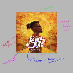
Just like the eyes are the window to the soul, the window to the soul of ‘Aisha’s Sun’ is its wonderful cover art. Vivid and smouldering, it aptly pre-empts the intensity of the album, as well as the rustic overtones that guide the project, both musically and parochially—via Kirani’s undying love for his hometown of Madina. “Everything done on this cover was deliberate,” cover art illustrator and designer Jesse Jay tells me over a Google Meet call, going on to breakdown the importance of the elements that make up the cover.
Before he got to illustrating, Jesse sat with Kirani Ayat, who gave him an in-depth view into his music journey and how it tied into ‘Aisha’s Sun’, creating a well of inspiration for the artist to draw from. Before that, the two had never met, only connecting through the production company Jesse works with, North Production.
A self-taught artist, Jesse Jay started off his art journey by doodling like many young kids, eventually using the internet as the tool to further his skill. “I just knew I loved art,” he tells me. Transitioning from portraiture to concept-fuelled work fairly recently, this cover for ‘Aisha’s Sun’ shows that his “blend of abstract and realism” is clearly driven by both his ability to create imaginatively and synthesise relevant information.
Our conversation with Jess Jay follows below and has been lightly edited for clarity.

NATIVE: Do you have a formal background in drawing?
Jesse Jay: No, I never went to art school or anything like that. I just knew I loved art. I always had screen savers of people’s art on my phone, I read a few articles on how to draw, how to paint, and started practicing. I mean, I did little sketches as a kid, like those chairs and tables that we did when we were younger. Then I progressed to drawing more complex stuff, like human beings, in a very minimal way. That’s how I evolved.
Can you remember your first commission when you started taking illustrating more serious?
My first commission was basically portraits of a few people. I just really transitioned into drawing concept illustration. The portrait work was like five years.
What was the motivation behind that transition?
For me, I’ve always loved to create illustrations that cannot be exactly mimicked on camera. I always like to have a blend of abstract and realism, so I can work with different colours, different textures and strokes.
For a self-taught artist, how did you know you were evolving on the right part?
Basically, I follow other artists who are really good and clearly have a lot of experience and skill. Like I said, I read articles and I watch videos, and I also practice a lot. That’s how I know I’m learning.
View this post on Instagram
What was your first music industry-related gig?
I did a cover art, just something I was playing with—it wasn’t commissioned. It was for a song by Medikal and Joey B, “Green Tea”, like two or three years ago. That was the beginning of my concept art journey with relation to music, it was more like an experimental process for me. It had some buzz, got some followers and recommendations here and there. Right now, I work with a team, North Productions, and that was a part of the process for me.
Is that how you connected with Kirani Ayat?
Yeah. I’d never met him, it was my boss at North Productions that introduced me to Kirani and gave me the opportunity to work on the cover art.
What was the process like for ‘Aisha’s Sun’?
It was a fun and interesting project. I enjoyed every bit of it, because it was more like him describing his story, what went on with his music career. Apparently, Kirani Ayat was living with his grandma, but his mum wasn’t supportive of his career as an artist, and his grandma later got influenced by his mum, so she also didn’t like the fact that he was in the music industry. Years after, they finally gave him that support and blessing for his music career, and they backed him spiritually with prayers. That was one of the things he described as a background for the cover, and we just went from there.
Were you able to sit with the music as well?
After he described the whole story, he shared a links to some of the project, because he was still wrapping things up. I listened to some of it, not the entire album, and it also really helped with inspiration.

The best way I can describe the cover is vivid. What were the intentions behind creating the cover?
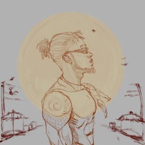
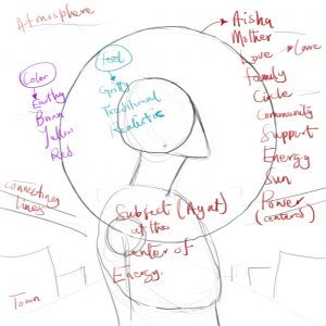
Everything done on this cover was deliberate. I started off with the background. Kirani comes from the northern part of Ghana, it has lots of red dirt on the ground, so I was inspired by that and you can see it on the cover. Instead of a blue sky, I wanted to exaggerate so I made it a red sky and it matches the sort of dusty environment around him. The sun behind him is his grandma and mum. ‘Aisha’s Sun’ is a homophone of the word son, so if you are a sun, that means your parent or whoever is taking care of you is a sun. The sun depicts energy, it depicts life, it depicts family as a circle, and it depicts positivity and confidence.
Then there’s the little circle on his neck with chalk which flows into these wavey strokes, and that’s a representation of his sound. There’s a red scarf on his neck depicting bloodlines. If you look closely, the road is more like a triangle, a pointing arrow. There are huts on the sides, just like a depiction of community and to give some symmetry, and the cable in the back depicts the township.
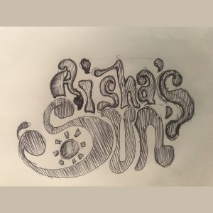
Were you also responsible for the text selection, because that’s really eye-catching?
Yeah, it’s actually custom made for the album. It was done from scratch by me.
Did you have to go through multiple sketches of these parts for the cover?
Nah, it was just one take. We had a lot of references to go through—mostly pictures of Kirani—and the story he also provided was inspirational. The whole idea was to create some earthy and something traditional, because of the sound. With him shirtless on the cover also, it just fit that direction.


